| Life is the art of drawing without an eraser |

Monday, April 19, 2010

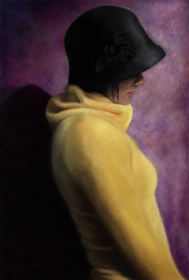
| Self Portrait | 2010

Self-Portrait, 2010

When I first began this assignment I knew instantly what portrait I wanted to use for inspiration. I was leafing through a magazine that I had gotten in the mail and this one portrait stood out to me instantly. The first thing I thought of was how much this portrait resembled me. I was also drawn to this portrait because of its contemporary edge. It is so simplistic yet so effective due to the contrasting colours and contrasting values. Her style—black hat and yellow sweater—were exactly something that I would wear. I tend to have this sophisticated style and I think that “Poise” by Casey Baugh depicted this style exactly—I even had a similar hat! I was drawn to the beautiful contrast of yellow and deep purple—a combination of cool yet warm hues as if emphasizing her ambiguous stance. Her stance is both assertive as if she is strong willed although she is turning her back to her audience as if she has something to hide from which is also mirrored by her downcast gaze that is shaded by the brim of her hat. Initially I was drawn only to this woman’s physical features; however, as I began to work on this piece to transform my self portrait to resemble the work of Baugh, I began to relate to her on a more psychological level. I don’t know if this is because I spent so much time looking at the piece or not, but it may also be because of the timing of when I worked on this project. I was going through some tough times in regards to decisions that had to be made. I wanted to go home for the summer as I had anticipated, but I lost my job that I returned to for three summers already. So as summer approaches quickly I am currently unemployed therefore I am uncertain as to where I will be living. I have this thing that I like to have a plan and being uncertain of what I am doing in two weeks gives me a lot of unwanted stress. Last week it really hit me hard as I became so overwhelmed with trying to figure out what I was going to do that all I wanted was to turn my back on everything in hopes that it would go away. Similar to this figure’s stance of looking away with her hat covering her eyes as if she is hiding, I wanted to hide so someone else could figure out what I was supposed to do. I felt that God was trying to tell me something, but I didn’t know what and all I wanted was for it to be over. It always seems easier to turn away rather than face the inevitable. Despite feeling this way I remained persistent and continued to apply for more jobs. I knew that I couldn’t give up which is similar to “Poise” as she stands with a straight back strong enough to withhold the pressures of life. I still feel overwhelmed with it all, but God is the one who gives me the strong assertiveness to persist through the hard times. Just today I got a phone call for an interview so maybe it’s time for me to lift my gaze and face what needs to be done head on.

This portrait also exhibits another more religious meaning for me. The stance of “Poise” is also slightly angled which gives hope of turning around just as God gives me strength to turn toward what he has planned for me. Despite the hope found in this portrait I also sense a looming shadow behind her. Perhaps she has some regrets behind her and she is trying to forget them. This may be for her, but for me the shadow resembles the darkness that I have also been feeling lately, not just because of the stresses of looking for a job, but my neglect of my faith. All Christians go through a time of darkness where God is put on the back burner—this is the way things have been for me for a while. There is a stark contrast between the light before her (and me) and the light behind which exhibits the tension that I have within. I need to turn my back on the darkness and look toward the light of my Lord. The downcast gaze resembles the busyness of my life that gets in the way of my relationship with God. The hat blocks the light of God from reaching my face; from lighting up my world. In a way, I need to take off my hat to allow the light in; to allow my Savior to light up my path ahead of me so that I know what direction to take.

After researching Baugh some more I became more appreciative of Baugh’s process. I found that he thinks it’s “foolish to adopt only the traditions of yesterday.” As a result, he intentionally combines the technology of lighting and computer software with traditional techniques such as the use of oil paints as his preferred medium. He views technology as a way of exploring new approaches to art. He uses technology to his advantage to balance the colour and values of his photographs before he paints them. As a result, I was drawn to this portrait for the process because I also combined the traditional style of painting with the technology of Photoshop by painting on the computer. Initially, I didn’t know what to really expect. I had seen the results of this technique numerous times, but I did not know how to go about it myself. I began by experimenting with different brush styles at various opacities and different colours. Once I felt comfortable enough I began to paint the background. Baugh begins by creating an underpainting which provides most of the texture for the rest of the painting. He continues by adding layers which is what I did also. Although it was unnecessary for me to exactly replicate his process due to the flexibilities of Photoshop; however, I feel that I was able to accomplish his technique fairly accurately despite the completely contrasting mediums. I liked the flexibility of painting on the computer—the use of the “undo” action was very helpful! The hardest part that I found was the colour choice. I used the eyedropper tool to match the colour, but due to the minute pixels it was difficult to accurately pick the right colour so I had to eye ball it sometimes. I also found it difficult to replicate the texture of a real brush. It seemed that regardless of what I did that the texture ended up smoother than what I intended, but I tried by combining various brush shapes, using shorter brushstrokes, and layer upon layer of thin colours to replicate the texture. Experimenting with texture is a skill I will have to continue to explore and something that cannot be mastered in only my first attempt. In addition, I found Baugh’s use of lighting technology to make it very difficult to photograph a similar portrait that replicated the exact shadows therefore I had to manipulate them somewhat in Photoshop which continues to utilize the advantageous elements of technology.

Creating this self-portrait by painting on the computer was definitely a very different experience. There were times when I wanted to reach out to smudge that little bit of colour with my fingertip. It was something to get used to having a screen between myself and my work. Toward the end it became easier. The flexibility of my tablet enabled me to have the flexibility similar to that of a paintbrush which contributed to the effectiveness and success of this portrait. Personally, I feel very satisfied with this first attempt at digital painting. It is definitely a technique that I will continue to pursue and experiment with.

Thursday, March 25, 2010

|| Natalie Diffloth | Computer Artist Profile ||

Natalie Diffloth is a graphic designer of 16 years who began with print and publication design, but more recently, has focused on web design as well. As a designer, she enjoys working with clients collaboratively with good communication in order to generate an understanding of what the client needs. At the same time she uses her expertise to balance the practical considerations of her clients with strategic objectives to solve problems in imaginative and creative ways. She develops solutions to her client’s needs, which stylistically reveal her eye for design.

Natalie’s clients predominantly consist of professional artists, photographers, boutiques and galleries as she strives to create clear, elegant graphic solutions and websites to promote the field of art. Natalie’s design work has her own personal flair; however, she treats each client and project in a unique way taking into consideration the client’s style, the timeline and project requirements. The work that emerges in response to her clients consists of postcards, posters, brochures, books or catalogs. Her style appears to be very organized. The websites she designs, for example, are not cluttered with unnecessary elements; but rather, utilize the elements and principles of design in a simplified manner that effectively communicates her client’s work to its fullest potential. Her design work does not take away from the product she is communicating. Instead, she uses design, such as strong contrasts, as a method to effectively display the work of others.

I chose to look at Natalie Diffloth for numerous reasons. First of all because she is a graphic designer and I have a huge interest in this area. I love graphic design because of its communicative purpose. The purpose of graphic design is to communicate or promote an idea. I admire her ability to make someone else’s work look good. Graphic design is not primarily about the self and does not involve the emotions as many other forms of art do. Behind graphic design is often the need for a solution to a problem that a client has, unlike painting, for example, which often expresses the emotion of the artist themselves. I also like Natalie’s approach to her work and how she pertains to the needs of specific types of clients that are all related to the field of art. Even though she pertains to the needs of her clients she is consistent in her clientele base and doesn’t design for just anyone. I also really like Natalie’s style as it has a touch of elegance. Her style is simplistically sophisticated, yet extremely effective in its intent. I don’t find to be a result of inexperience or an inability to design, but I see it as a sign of an ability to design. My approach to graphic design is also very simplistic as well. I feel that it is much harder to achieve a successful design project with a limited set of elements because you have to be carefully selective. Even the placement of a simple straight line can be very powerful if it’s done properly. I also like what Natalie’s work consists of—brochures, catalogues, posters—because I feel that a well designed brochure is so important, especially in this day and age when everyone is trying to grab everyone else’s attention amidst such busyness. It disheartens me to see a brochure or a poster, for example, that are not well designed. Also, I like how Natalie is a versatile graphic designer as she is fluent in the language of design as well as web design which is a valuable key to success because many clients want to brand a company; therefore it is important to be able to carry the brand across all digital areas. Overall, I think that Natalie is a successful designer whom I admire for her strong ability to communicate in a simply effective way.

Link to her website: http://www.diffloth.com/

Wednesday, March 3, 2010

Playing with text...


When first assigned this project I was so overwhelmed and had no idea what to do because I love using text in Photoshop so there were so many different techniques that I wanted to try so I just could not make a decision! I had really liked the idea of using text to compose a portrait, but I initially thought that we had to do something that included the Bible, but I was mistaken so that was a huge relief and made things much easier! I proceeded to stick with a portrait, but then I faced the decision as to what portrait to use. I could have done a generic face, but then I feel that the text would not be as effective so I wanted to chose a significant figure who had a lot of writings and insightful words. I had recently seen the movie "Invictus" which is the story of Nelson Mandela, therefore I proceeded to use his portrait composed of inspirational words that he had said in his famous quotes or words that define him as a successful leader. Once I got my idea down pat I then made individual brushes for approximately 15 words. Then, I used the magic wand to select various areas and then in those areas I placed the various brushes that I had made in a variety of sizes, which proved to be very time consuming. I used this method for the remainder of the portrait until I felt that the portrait was recognizable as Nelson Mandela. This is just one of the methods of using text to compose a portrait so next time I will try something else...I want to try to make another portrait that is composed of text that follows a path to outline the facial features which will take much more time than this one already did.

Wednesday, February 10, 2010

Mirroring images through colour and pattern...

For this exercise we were asked to take two different images and mirror each other through the repetition of similar colours and patterns. I chose to take different images that still stuck with the same theme of fashion. Although the one image is a mannequin while the other is a fully dressed woman. I used the image of the woman as my "root" image - I didn't alter it very much, but used the colours and patterns in the other surrounding images. I used various methods such as creating displacement maps for patterns, used colour replacement tool and played with curves to get the colour levels to be similar. I hope that my choice of images are disconnected enough to make this an effective assignment. I enjoyed making the images "match" in a sense so they look like they belong together.


Friday, February 5, 2010

Photo enhancement...for the good...

In class we talked a lot about the idea of photo enhancement to make people look "perfect;" to eliminate people's "flaws" with the never ending capabilities of Photoshop. For example, making someone look younger--but why does age have to be something we want to put off as long as possible? Isn't there some sort of beauty found in the wrinkles of an aged face or worn hands? Wrinkles speak of character and experience so I don't understand why our society fears the presence of a wrinkle.
Eliminating "flaws" denies the uniqueness of us humans therefore we were challenged to enhance a photo to emphasize an ideal. I chose to deal with the idea of hunger and starvation. So rather than making someone look skinny like a society likes best, I chose to do the opposite by using the bloat tool to thicken the arms and legs of a little boy to make him look like a healthy boy should. I am not completely happy how the bloat tool manipulated the colour of the skin, but I wasn't sure how to fix that. I also added some healthy looking colour to his face and made him smile...no child should be so unhappy as the original. It is just not right for little children to be starving and as skinny as this boy was. I also clothed him which proved to be a challenge because I had to find another picture of a shirt that was in a similar position as my original photo. I then continued to use the liquify tool to make the shirt fit and then I used the burn and dodge tools to correct the lighting. I would have liked to put him in a better setting, but time was my enemy yet again as the hours slipped by as I was so engrossed in this assignment.

Original photo:

Enhanced photo:


Sunday, January 31, 2010

Photo restoration exercise...

For this exercise I chose to restore this particular photograph that I found online circa 1920s. I absolutely love old photographs, in particular vintage fashion, so I really enjoyed this assignment. It was good practice with the clone and healing tool as well as colour replacement. I also added some vintage text in the background to still give it that vintage look amidst a restored old photograph.


Thursday, January 21, 2010

Experimenting with colour...

This exercise involved using various ways to replace colour or to experiment with various colour adjustments. I found this assignment fun and interesting in that there are so many ways to achieve colour replacement and there are so many various effects that can be created. There are so many more that I could have done, but there is a point when enough is enough....but here they are...the first one is playing with colour adjustments and the second is using various methods of colour replacement.

Colour Adjustment:


Colour Replacement: